Wednesday, 21 May 2014

Reflect Presentation

For my presentation I wanted a character that was simple and would work with the game structure of the slides. I felt that drawing a simple version of myself would work well with the reflect theme as I am reflecting on my experience over the year.

I began to sketch styles that I could draw the character with, I did not want the character too detailed as I wanted it simple as to be less of a focus than the main body of work that would be in the presentation. I wanted to show examples of work that I enjoyed doing whilst on the course, such as storyboarding and character designing.


I wanted a title card for the presentation and used the storyboard as an influence, using characters that I had created for previous animations with in the background and having my character in the frame as well. I thought having a title text would work with the composition as it reminded me of the covers for games, in which I could also end the last slide of the presentation as well.


I wanted to add some animation in the powerpoint which I had to make in the form of gifs, as the mov files were too big for the powerpoint to show. I could have embedded a youtube video but I did not want to have to click play for each animation to show, I wanted the animation to flow with the presentation.


I kept the main structure of each slide quite simple as I did not want the powerpoint to look too cluttered, as when you look at a powerpoint which has a huge body of text with multiple images cluttered together, it makes it hard to read and focus on the main point of the slide. I only wanted to include a line of text at the most for the dialogue box which I would go into detail as I talk alongside the presentation.

Presentation Anxiety

When presenting to peers, I find myself talking too fast and skipping over important information that I wanted to talk about as I panicked with the pressure of remembering what I wanted to say, and I end up avoiding it completely.

To help myself I looked at what techniques or stages in which to prepare myself for presenting. I found three points that could help me with my problem of presenting to a group of peers;

1. Exercise - interestingly getting the blood flowing can help through how it can make you feel positive, which could help with confidence for presenting to peers. I feel that this confidence can help me when talking especially if I forget what I wanted to say, I can then improvise with confidence.

2. Rehearse - I normally try to memorise what I want to say during the powerpoint in the attempt of not forgetting what I want to say, however it normally ends up to built up stress which results in myself talking fast or skipping a slide as I have completely forgotten what I wanted to say. Rehearsing however could help me solve this problem, as it can build confidence and reduce stress the more that you go through what you want to say. It gives you the change to improvise whilst presenting which works better than memorising my presentation as it creates pressure.

3. Appreciation - I need to keep in mind that the audience is listening, I need to keep them engaged, get them involved, whether it is making them laugh or agreeing with their opinion on the subject of the presentation. "If your audience knows you want to add value to their life, you will immediately feel a sense of ease because it will define your purpose and role in the presentation environment" (1)

For my next presentations I need to ensure that I approach the presentation day calmly, purposely doing something that I know will make me feel calm and prepared for talking to peers.


(1) http://blog.slideshare.net/2013/11/18/how-to-combat-presentation-anxiety/index.html

Animated self - animating


I decided to change from the storyboard I produced to one that included a throw cycle alongside a walk cycle. I liked the idea of a throw cycle as not only is it more challenging but also involves more kinetic movement than the jump that I wanted to include in the original. I got carried away with the design of the character as I automatically felt that the character had to change design to suit the theme of the throw cycle.

To help myself with the inbetweens I animated traditionally as I found it easier and quicker to produce a rough animation with graphite and paper than digitally. I could also check the posture and angle of the character and change it quickly compared to digitally which I would be tempted to create the design again.
I was inspired and aided by reference sheets of the key poses that go into the throwing cycle, through these poses I thought it would work well if I added a catch sequence before the main action, I felt that this would work well with showing anticipation of an action with in animation. After I had scanned in the traditional I drew over the rough animation with the pen tool to create the features of the character.

main key poses


For my walk cycle I first animated in the style of the previous storyboard but I did not want to continue with this style of character as it did not match the previous character well and I wanted it to link in with another. 
However looking at the walk cycle I can see where I have gone wrong. Besides the speed of the animation, the walk seemed too stiff as the arms were not moving either, and I had missed a key frame in the animation as well which makes it skip slightly. When creating the final walk cycle I know to animate the arms as well so that the whole motion runs smoothly.

Comic designs

I begun collaborating with Roxanne Shanks to create a comic that was based in a post apocalyptic world that is bathed in snow and the world is plagued with robots that enslave what is left of the human race. The plot follows the few resistant humans that have developed new forms of technology that can defend against the robots.

I felt that this plot would be a good challenge for me as I would have to draw landscapes that are desolate with decaying buildings which would be different to what I normally draw, alongside with the form keeping my style consistent. I have the reoccurring problem of keeping a consistent style, I draw one character and draw the character again but the hair or eyes would be different, which is good when developing the character but not when drawing storyboards or animations as the viewer would be confused. I feel that this comic can help me develop my drawing skills as I would have to be able to draw the character consistently with the nature of the project.

So far the comic is in its initial stages in which I am developing with styles and sticking to the requirements needed for the comic and Roxy's design of the characters. Having this restricting style of what the character and landscapes should roughly look like is challenging but also helpful in trying to keep to a brief that can help me prepare for future deadlines.

Roxys design

My concept on the characters

Initial designs for the robots

Character design

I wanted to develop my style from one which was mainly influenced by a western approach rather than a Japanese style. I feel that I have got to the stage where there is not much room to develop if I continue drawing the style I am currently using.

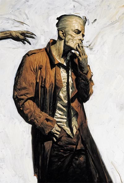
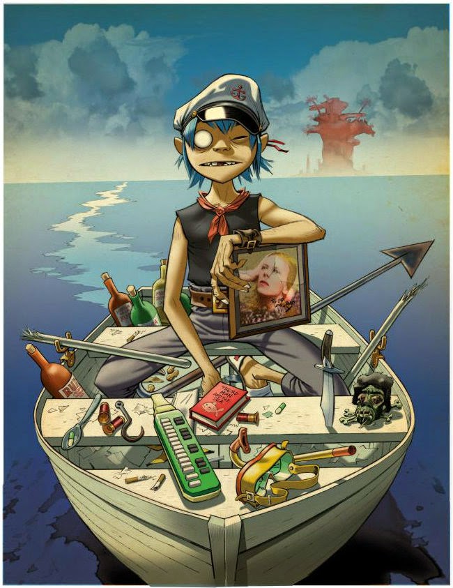
I am heavily influenced by the work of Phil Hale and Jamie Hewlett;

Phil Hale
  • A illustrator/painter that creates some work in response to comic books.
  • I love his realism approach to his characters that are given depth, a form of life with the use of shading and highlights of the light source in the composition.
  • I was influenced by his Constantine design which he made for the Hellblazer comic, the angular jaw and the shading in his face worked really well with the attitude of the character.


Jamie Hewlett

  • Hewletts work is very stylised compared to Hales work, the proportions and less realism style works well with the experimental British band Gorillaz.
  • I love the variation of line that compliments the shading of the composition.
  • I am heavily inspired by Hewletts character design, the amount of creativity and thinking work well with the craziness of both the band and the artist. I love how the elongated proportion works with the clothing and facial features of the characters. For example the character 2-D has no eyes and bright blue hair, the structure of his face however ties these elements together and each compliment the other.

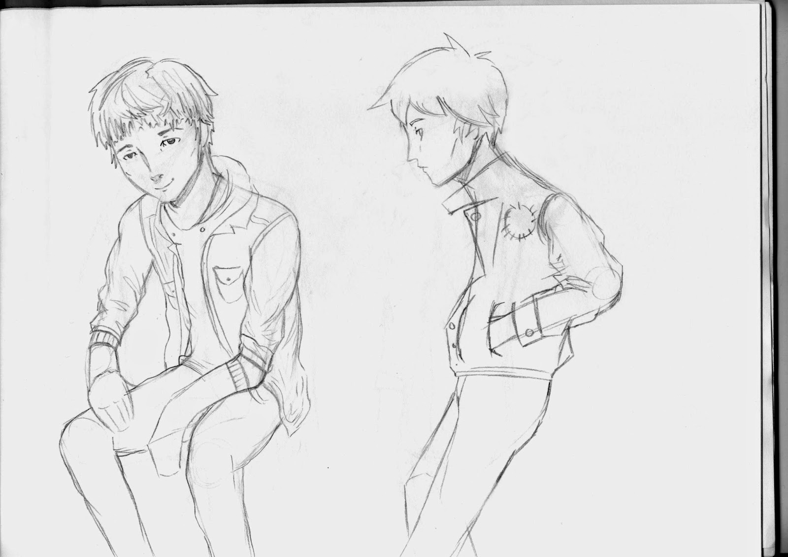
I want to take influence from both of these artists to develop myself as both an animator and a character designer, I began to draw using varying angles and poses, to try and change my style.
I found it hard to draw the character in a 3/4 pose angled towards the right of the frame as I am comfortable drawing to the left of the frame and have become used to drawing to that angle. Drawing to the right made my character look like his head was shorter and lost part of his jaw line. In order to solve this I need to draw characters to the right of the frame and become used to drawing in that format, I think drawing just the head and purposely large will help me get used to it.

I enjoyed trying to change my style to one that is less manga like, which I first attempted by changing the size of the eyes and the form of the nose. I found that I tend to draw eyes bigger than they should which works with the character I would be drawing but it would not link to the western influence that I wanted with my illustrations.


Friday, 16 May 2014

Reflect Storyboard

For the presentation I wanted to use the layout that would show a character with a small amount of dialogue and screen shots in the background of the frame as to link to what I would be talking about as the presentation would be playing. I created a rough storyboard as to plan timing and what I want the structure of the frame. 


I was inspired by mainly nintendo ds gameplay with the dialogue speech bars/bubbles at the bottom of the screen. I also liked the idea of  having the name at the top, with different character expressions, but with the character more at the side of the frame to show screenshots of work.


With the Professor Layton layout it could be possible to add two characters in the frame with out it looking that crowded. This could work well as I could create characters for the presentation to reflect how interested I am with character design. 

Thursday, 15 May 2014

Animated self - Reanimated idea

I thought about revisiting a previous animation and reanimating it by editing and recreating some of the scenes, adding inbetweens and overall making the animation smoother. I realised that I wouldn't be able to directly reanimate the original elements animation as the animation had already been submitted. However I could take the character, redraw and apply more animation disciplines to the animation.
I thought about changing the plot by adding and taking away scenes which would lead up to the character making a snowman, so the animation would take elements from the original animation. I felt that this would work well as it shows how i have reflected on what went wrong or didn't work in the original and then created something that shows how I would have changed it. 


I quickly animated only the hair of the redrawn character and moved the character across the screen as if he would be walking. I really enjoyed this as I made the hair emphasised as it moved and moved with the momentum of the action. I wanted to make a test to see if  would continue with this form of animation and with the character. 


Animated self ideas

To help myself generate ideas I began to list down what the requirements would be and what theme I could take with it. This helped me to think of ideas that could fit with these themes, such as character designing - I could have a turn around of the character, etc.


I thought about mixing two animation processes together, in this case traditional to digital, pixels to pencil, which I thought would work well with trying to develop my animation skills. I thought about a narrative which involves a character waking up, opening the curtains and behind the curtains is a world full of animated characters/references to animations that have inspired me during the 1st year. I liked this idea however I did not think that it would work well with the animation references at the end of the narrative as there are certain expectations of how the character should move, look like and their expected characteristics.
I decided to leave this idea and think about what I need to improve on or what I want to develop/work on in the future, for example to animate better or focus on character designing.


Notes
  • Reanimate a previous animation, animate jack and kill storyboard, character designs of the character deigns have them morph into one another, key poses going back and forth, don't think about a high expectation audience, simple turn around or spin around, different characters, think about narrative?
  • I like the idea of game cut scenes and character design.
  • something that would show how I want to improve on my animating skills?

I made another page of notes in my sketchbook which were aimed at improving my animation skills. I quite liked the idea of re-animating a previous animation to show how much I have developed since and to show a sense of understanding with animation. I thought about which animation I wanted to improve the most and immediately thought about the elements animation that has room to continue and change scenes of the narrative. For example, the plot could revolve around the character making a snowman.


I thought about possibly changing the story but keeping the character so that it related to the elements animation. For example it could be set in a different season, such as summer and the narrative could relate with summer activities, flying a kite and eating ice cream. I wanted the scenes in the plot to relate to different animation disciplines or just a selected few to relate with wanting to improve my animation skills. 


Wednesday, 14 May 2014

reflect further ideas

To generate more ideas I started to write down questions that I needed to answer in my presentation, such as what are your strengths and weaknesses and what did you enjoy the most this year? Writing these types of questions down  made me think about how I could relate the answer to the imagery. For example, the question weaknesses could be drawing the anatomy of a character and the imagery could relate to how I overcome this which is practising and drawing.

As the powerpoint is a reflection over what I have achieved and looking at the past year, I wanted to include screenshots or mini gifs of the animations that I have created, such as the very first animation that I made on the course which could be shown through the presentation like a cinema screening as the curtains draw back. I could then compare the first animation I made to the latest one that I had made on the course, this comparison showing how much I have improved/changed with my animation style.

I need to remember that the presentation is only 5-10 minutes and at least 5 minutes needs to be given to peers to ask questions. To get the timing of the presentation correct, I thought about planning the questions out through powerpoint at first to understand how long each question will take me to answer.


Sketching more helped me to plan what the slides could look like, I redrew the speech bubble idea and felt that it could possibly appear over crowded with both the characters and the speech. I then decided on only having one character and having the character moving slightly, like talking with their arms and moving head slightly as the screenshots or imagery change behind this character. I liked this idea however I didn't know where the text would be placed with in this design, I didn't want too much text as I knew this would crowd the slide too much. I was then inspired by the gameplay of the Professor Layton games, where the text is placed in a rectangular shape at the bottom of the screen with the character slightly moving as the text is shown. I really liked this idea and thought that this would work well with the presentation layout.


Noting down notes that could be useful for idea generation

Noting rough answers for questions that I could answer during the powerpoint

Thursday, 8 May 2014

Reflect presentation initial designs


This brief sets the task to talk about your experiences, your weaknesses, what you feel was successful and unsuccessful and ultimately how far you have come from first starting the course.
I came from an illustration background and was in love with Studio Ghibli and had yet to find out about about Winsor McCay, Ryan Larkin and other animators/animations which had created such beautiful and pioneering work, influencing animations today. Animation is not just a set medium as such, it is versatile, it is seen in games, feature films, commercials, title sequences and even motion comics.

For the talking content, I thought about having two main examples of work, for example the first animation I had ever made at the beginning of the course and comparing it to the latest one I had made, with screen shots of other animations and work that I have done. The other idea being a demo reel at the end of the presentation, with screen shots of the work I would be talking about and then seeing the finalised animations at the end.

For the slides with in this presentation, I wanted something that would make it interesting. I thought about incorporating the use of slight animation seen in Rebecca Mock's illustrations that she did for the New York Times, each slide having a different illustration or slight movement with in the illustration.

I then add the idea of having two characters looking at the screen which would have speech bubbles, one with the general question that I would be answering in my talk, for example what are my strengths and weaknesses, and have the other character with a speech bubble with a summarised answer.


Malaria


This piece was interesting through how the imagery was portrayed, which told a westernised story of the character, the grim reaper, where another character is sent to assassinate the reaper.
The illustrations were quite detailed and had a dip pen approach to the lineart, making it tactile along with the addition of the props. The inclusion of props worked really well, such as burning the page to transition to the next, the addition of a book when the character opens a book, the use of red ink to show blood, etc. It worked well through how the use of the props linked with the narrative or character dialogue. I felt it was an interesting depiction of the dialogue as text was shown underneath pre-cut parts of the image, and the magnifying glass was clever through how the next image was the zoom of the magnifying glass.
The video felt like an advanced version of a pop up book through the addition of origami and the parallel pop up book mechanism among the use of the props.