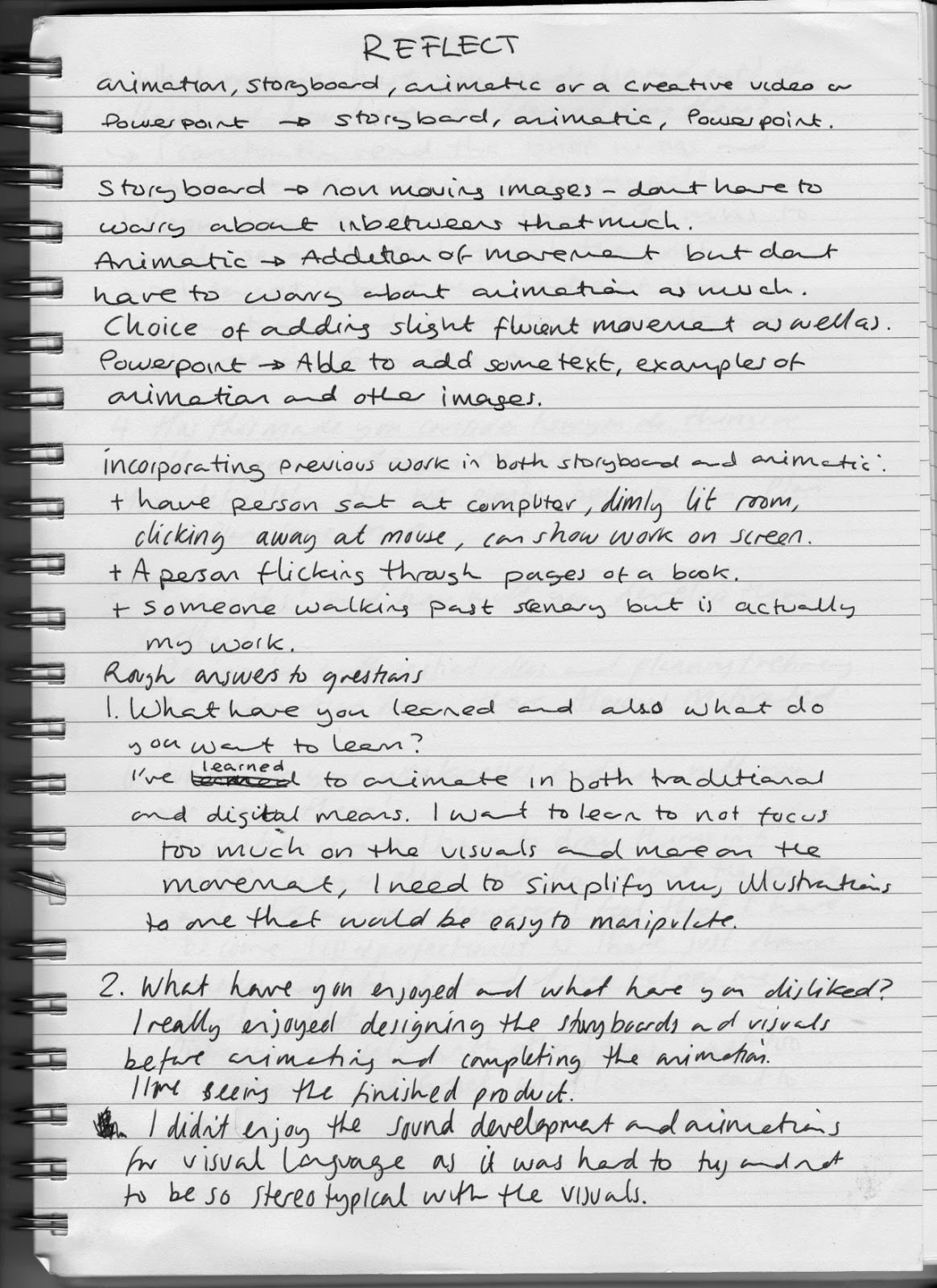
Monday 24 November 2014

Leeds International Film Festival: Giovannis Island

Giovanni's Island follows two boys during World War II on a small island near Japan. The small community is invaded by Russians, who gradually take the peoples home and food rations. The boys father takes it upon himself to share soliders rations between the people and gets caught whilst trying to keep the rations hidden. From this the boys are taken to a far away town in Russia and try to find their father, losing people along the way.

The hand drawn animation for Giovanni's Island was gorgeous, it contrasted nicely against the heavily intricate and detailed painted backgrounds, with the addition of CG. It actually worked well with the animation as it absorbed the stylization and atmosphere that the hand drawn quality gives to the narrative. The animation style reminded me of the film 'Summer Wars' with the use of the thin lined animation, and use of matte tones, and the narrative reminded me of Miyazaki's 'Grave of the Fireflies' through the setting and view point of the boys that the narrative followed. - Both Grave of the Fireflies and Giovanni's Island start with a scene from the end of the film before going into the story - a flashback. It was interesting to see how the camera angles in the film emphasised the emotions throughout the film, one of which was from the perspective of the boys, highlighting the boys vulnerability compared to the adults around them. The animation style changes when the Galactic Train appears before the main protagonist - the animation is presented in a line art fashion with a galaxy background that represents the child like dream perception of the scene - I found this really inspiring through the change illustrative style, the chalk like appearance of the train as if drawn by a child.

I was really inspired with the character and background design, I found a few production sketches from the film, it was interesting to see how they would design the prop, and then show how it would interact with the character, considering light and shadow, volume and size.


Leeds International Film Festival - Dragon Ball Z: Battle of the Gods

Compared to traditional cel animation to the new digital animation, the animation is shiny, clean and neat however it doesn't hold the original stylization that fans love as much. The animation itself was smooth and the anticipation worked well with the actions that the main characters used, for instance the super saiyan god technique. The movements of each character were quite exaggerated, over the top expressions for humor, which works well with the fantasy and anime theme.

The CG that was used in the animation, was covered up quite well in places, as a texture in the style of the 2D animation was placed on top to stop it from standing out from the rest of the frame. The only scene which the CG stood out too much was when the main protagonist Goku got into a car and drove around the small planet that he was on. I think this was due to the repeated animation that was with the CG car that really made it standout compared to the other animation.

I was particularly inspired by the character design for the two new characters that were introduced, Whis and Beerus. The design for these characters were interesting through how they were designed in a Egyptian fashion mixed with a space/futuristic blend - this can be seen in the rings and extra cuts of fabric that are on the clothing.

I was also really inspired by the framing in the action scenes - when Goku and Beerus fight each other the camera shots followed the animation as it sped through scenery. This inspired me with approaching storyboards - considering how drastically changing the angle of the scene could make the action more interesting.

I can see that this film will be the beginning of a new franchise of the already popular series due to the new form that the main character has obtained and the ending of the movie which gives the impression that a few more films will be made to complete the narrative.


Whis
Beerus


Monday 17 November 2014

Thought Bubble: Sketching Panel - Notes


What do you do?

Babs Tarr - Made money through college by commissions and selling traditional oil paintings. This helped her alot with her digital work, especially with layering backgrounds in panels. Bat Girl was her first comic in which she draws for DC Comics. Previously she was a 2D game artist during the day and freelance in the evening, until she decided that she definitely wanted to freelance for a living. For the Bat Girl comics, she collaborates with Cameron Stewart who does the layouts as she draws the illustrations as she finds it hard to direct a scene and making the panel atmospheric.

Emily Carroll - Mainly creates horror and fairytale comics, being both the writer and the illustrator, and is her own personal thing. She does sometimes include gifs with in her work to emphasise her work, using photoshop to create it. She went into webcomics as she didn't know how to publish her work - she uses mixed media, ink washes, graphite etc.

Boulet - Creates his own webcomic, which needs alot of planning. Finds computer colouring annoying, watercolours are more aesthetically appealing, cheap and quick to use. He draws from life - realistic style at times, as he was good at life drawing but could never use this in his comics. It was a challenge to make both non and realistic drawings - the change between the two.

What informed your style?

Babs Tarr - She found the foundation course she took helpful as she learned a broad range of skills that she uses to inform her cartoony style. Life drawing was a huge aid in her work, helped her to learn to draw quickly and in a good quality with the 5-10 minutes poses that you would do.

Danielle Corsetto - Draws from life - 2 1/2 hours on a Wednesday is dedicated to life drawing - a break from her webcomic - tends to focus on certain parts like the feet or hands. Quite objective, likes short poses as easier to make cartoony whereas the long poses are a challenge and forces her to become more realistic in style. Makes life drawing simplistic, think about the poses, deciding which lines you need and dont, thinking before drawing.

Babs Tarr - Starts with a sketch, own personal work and then breaks down the items - background, layout, figures etc, only draws traditionally at conventions as normally she works digitally, faster and easier to produce. Prefers traditional.

How do you handle people helping you or taking part of your workload?

Boulet - Had an assistant, in which he would create scripts for the assistant and then create drawings from that. The drawings were good but didnt like giving the control of the comic away. However it was interesting to leave her to do what she wanted, a different view point, both merged to make a new story, "sometimes you have to give up and let it go"

Babs Tarr - Had 2 assistants, one does patterns, dont touch the main illustration, alot of work, hard to complete it all with the narrow deadlines. Would finish a comic and take a break, then stress about the work she should have done.

Emily - Had assistants but finds it hard to let others take control, likes working by herself.

Sketchbooks?

Boulet - Sketchbooks, uses it to record memories, much like a photo album, draws scenes of where he is and views, people around him, everyday life, gains inspiration from this. When drawing he draws directly in ink, no sketches or references. Tends to rip out pages quite alot. Uses Twitter to help him draw - asks a question to his followers for a theme to draw and draws these whilst traveling, a good way to generate ideas and challenge narrative/design.

Emily Carroll - Gets inspiration from dreams and folklore, childrens books and fairytales. Always carries a journal with her, instead of drawing characters, she draws thumbnails and storyboards to generate ideas,


Thought Bubble: Sketching Panel (Saturday)

The sketching panel was extremely inspiring, it was interesting to see how they work, whether they start with sketches or draw straight in ink, and it was also inspiring to know how they started their work, and why they chose that form of media and publication.

The sketching panel included:

Danielle Corsetto - The creator of the webcomic "Girls With Slingshots", she has also wrote and drew "The New Adventures of Bat Boy" for the Weekly World News, and written two Adventure Time graphic novels for BOOM! She currently works with three other people on her webcomic including interns.


Babs Tarr - A full time freelance illustrator with a BFA in Illustration. She currently draws for DC comics for the new "Bat Girl" comics, and previously she has worked with Cartoon Network, Disney, Boom!, Brand X and Hasbro. Her work has also been featured in magazines such as ImagineFX, Juxtapozed and Comic Alliance.


Emily Carroll - An illustrator who graduated with an animation degree. Currently she has been making horror and drama webcomics. She has some published work, with publishers Dark Horse, Vertigo and First Second, her first book which was published "Through the Woods". Not only does she illustrate and write books, she also works in the game industry in games such as The Yawhg and Gone Home.


Boulet - A full time webcomic illustrator, in which he created "Bouletcorp" and in the process created an english website for these comics. He also works traditionally and rips out pages from his sketchbook much like I do. In his comics he includes parts of animation and gifs.


Tuesday 11 November 2014

Leeds International Film Festival - Appleseed Alpha

Appleseed Alpha is set in a post-apocalyptic earth, where the surviving humans coexist with cyborgs which have a higher ranking than the humans. The main characters, 'Deunan' a human who fought in the war, and 'Briareos' an elite cyborg designed for war, end up helping a girl and an android who they find whilst doing a mission for a robot named 'Two Horns'. The narrative was obvious in some parts but it was still very entertaining and gripped the audiences attention with the explosions and action that followed suit with the two main characters where ever they go.

The appearance and movement of this animation was amazing with the use of CG, the backgrounds were very distressed and worked well for setting the scene of a post apocalyptic earth. The lighting was stunning it helped to set the atmosphere through the use of shadow, the shadows helped to make the characters more sinister and show how bright and desert like the earth had become.

The animation for the robots were far better than the movement of the humans. The robots animation held more personality through the exaggerated walk cycles and general movement, which can be seen in both the characters, 'Two Horns' and 'Briareos'; Two Horns having a casual slumped approach, and Briareos, being more aware and alert. This use of movement added to the characters personality helped the audience to identify with these characters, able to tell whether the character is good or bad. The animation for the humans however lacked in these exaggerations, they lacked any stylized movement so the actions felt boring, for example there wasn't alot of anticipation to make the action more exciting/tense when the main character was fighting the enemies she faced. At one point in the movie the main character Deunan jumped into an armored suit and ran alongside with Briareos, and the movement of the suit was far too quick and felt jagged compared to the smooth animation of Briareos.

Deunan and Briareos

Monday 3 November 2014

Gorillaz

The British band Gorillaz has always inspired me through their character design and animations that went along with their albums. The movement of the character animations are emphasized to portray the personality of each individual and exaggerate the style of the designs. The animation then evolved to using 3D software, in this case Autodesk 3DMax, creating a realistic perspective of the virtual band. The 3D animation was used alongside film which worked well as the characters interacted with the objects around them. Even though the animation has become more realistic with the rendered textures, the characters still hold the illustrative style of Gorillaz that they are known for. 


The animatic inspired me through the use of the imagery being key frames for the final product, capturing the main emotion and movement for that frame, the use of colour to emphasise the atmosphere and the use of the camera angles to exaggerate the scene.

Looking behind the scenes of the music video, it as interesting to see the designers adding textures to the 3D models and also the basic polygons that the characters are modeled from. From this I saw the importance of the performance reference before the movement of the animation, to create a smooth action.

I feel like I can identify what practice that I want to work in, through the animation and modeling of the characters seen in the Gorillaz music video 'Do Ya Thing'. I enjoy storyboarding, making animatics, and character design/animation, in order to inform my area of practice, I want to look at modelling in own time, looking into creating textures and making cartoon based models, and also create a short storyboard and animatic of a character animation of the model I would be making. To show this process I could look into creating a time lapse of making the model - look into recording process? what equipment is needed? av suite?


Wednesday 21 May 2014

Reflect Presentation

For my presentation I wanted a character that was simple and would work with the game structure of the slides. I felt that drawing a simple version of myself would work well with the reflect theme as I am reflecting on my experience over the year.

I began to sketch styles that I could draw the character with, I did not want the character too detailed as I wanted it simple as to be less of a focus than the main body of work that would be in the presentation. I wanted to show examples of work that I enjoyed doing whilst on the course, such as storyboarding and character designing.


I wanted a title card for the presentation and used the storyboard as an influence, using characters that I had created for previous animations with in the background and having my character in the frame as well. I thought having a title text would work with the composition as it reminded me of the covers for games, in which I could also end the last slide of the presentation as well.


I wanted to add some animation in the powerpoint which I had to make in the form of gifs, as the mov files were too big for the powerpoint to show. I could have embedded a youtube video but I did not want to have to click play for each animation to show, I wanted the animation to flow with the presentation.


I kept the main structure of each slide quite simple as I did not want the powerpoint to look too cluttered, as when you look at a powerpoint which has a huge body of text with multiple images cluttered together, it makes it hard to read and focus on the main point of the slide. I only wanted to include a line of text at the most for the dialogue box which I would go into detail as I talk alongside the presentation.

Presentation Anxiety

When presenting to peers, I find myself talking too fast and skipping over important information that I wanted to talk about as I panicked with the pressure of remembering what I wanted to say, and I end up avoiding it completely.

To help myself I looked at what techniques or stages in which to prepare myself for presenting. I found three points that could help me with my problem of presenting to a group of peers;

1. Exercise - interestingly getting the blood flowing can help through how it can make you feel positive, which could help with confidence for presenting to peers. I feel that this confidence can help me when talking especially if I forget what I wanted to say, I can then improvise with confidence.

2. Rehearse - I normally try to memorise what I want to say during the powerpoint in the attempt of not forgetting what I want to say, however it normally ends up to built up stress which results in myself talking fast or skipping a slide as I have completely forgotten what I wanted to say. Rehearsing however could help me solve this problem, as it can build confidence and reduce stress the more that you go through what you want to say. It gives you the change to improvise whilst presenting which works better than memorising my presentation as it creates pressure.

3. Appreciation - I need to keep in mind that the audience is listening, I need to keep them engaged, get them involved, whether it is making them laugh or agreeing with their opinion on the subject of the presentation. "If your audience knows you want to add value to their life, you will immediately feel a sense of ease because it will define your purpose and role in the presentation environment" (1)

For my next presentations I need to ensure that I approach the presentation day calmly, purposely doing something that I know will make me feel calm and prepared for talking to peers.


(1) http://blog.slideshare.net/2013/11/18/how-to-combat-presentation-anxiety/index.html

Animated self - animating


I decided to change from the storyboard I produced to one that included a throw cycle alongside a walk cycle. I liked the idea of a throw cycle as not only is it more challenging but also involves more kinetic movement than the jump that I wanted to include in the original. I got carried away with the design of the character as I automatically felt that the character had to change design to suit the theme of the throw cycle.

To help myself with the inbetweens I animated traditionally as I found it easier and quicker to produce a rough animation with graphite and paper than digitally. I could also check the posture and angle of the character and change it quickly compared to digitally which I would be tempted to create the design again.
I was inspired and aided by reference sheets of the key poses that go into the throwing cycle, through these poses I thought it would work well if I added a catch sequence before the main action, I felt that this would work well with showing anticipation of an action with in animation. After I had scanned in the traditional I drew over the rough animation with the pen tool to create the features of the character.

main key poses


For my walk cycle I first animated in the style of the previous storyboard but I did not want to continue with this style of character as it did not match the previous character well and I wanted it to link in with another. 
However looking at the walk cycle I can see where I have gone wrong. Besides the speed of the animation, the walk seemed too stiff as the arms were not moving either, and I had missed a key frame in the animation as well which makes it skip slightly. When creating the final walk cycle I know to animate the arms as well so that the whole motion runs smoothly.

Comic designs

I begun collaborating with Roxanne Shanks to create a comic that was based in a post apocalyptic world that is bathed in snow and the world is plagued with robots that enslave what is left of the human race. The plot follows the few resistant humans that have developed new forms of technology that can defend against the robots.

I felt that this plot would be a good challenge for me as I would have to draw landscapes that are desolate with decaying buildings which would be different to what I normally draw, alongside with the form keeping my style consistent. I have the reoccurring problem of keeping a consistent style, I draw one character and draw the character again but the hair or eyes would be different, which is good when developing the character but not when drawing storyboards or animations as the viewer would be confused. I feel that this comic can help me develop my drawing skills as I would have to be able to draw the character consistently with the nature of the project.

So far the comic is in its initial stages in which I am developing with styles and sticking to the requirements needed for the comic and Roxy's design of the characters. Having this restricting style of what the character and landscapes should roughly look like is challenging but also helpful in trying to keep to a brief that can help me prepare for future deadlines.

Roxys design

My concept on the characters

Initial designs for the robots

Character design

I wanted to develop my style from one which was mainly influenced by a western approach rather than a Japanese style. I feel that I have got to the stage where there is not much room to develop if I continue drawing the style I am currently using.

I am heavily influenced by the work of Phil Hale and Jamie Hewlett;

Phil Hale
  • A illustrator/painter that creates some work in response to comic books.
  • I love his realism approach to his characters that are given depth, a form of life with the use of shading and highlights of the light source in the composition.
  • I was influenced by his Constantine design which he made for the Hellblazer comic, the angular jaw and the shading in his face worked really well with the attitude of the character.


Jamie Hewlett

  • Hewletts work is very stylised compared to Hales work, the proportions and less realism style works well with the experimental British band Gorillaz.
  • I love the variation of line that compliments the shading of the composition.
  • I am heavily inspired by Hewletts character design, the amount of creativity and thinking work well with the craziness of both the band and the artist. I love how the elongated proportion works with the clothing and facial features of the characters. For example the character 2-D has no eyes and bright blue hair, the structure of his face however ties these elements together and each compliment the other.

I want to take influence from both of these artists to develop myself as both an animator and a character designer, I began to draw using varying angles and poses, to try and change my style.
I found it hard to draw the character in a 3/4 pose angled towards the right of the frame as I am comfortable drawing to the left of the frame and have become used to drawing to that angle. Drawing to the right made my character look like his head was shorter and lost part of his jaw line. In order to solve this I need to draw characters to the right of the frame and become used to drawing in that format, I think drawing just the head and purposely large will help me get used to it.

I enjoyed trying to change my style to one that is less manga like, which I first attempted by changing the size of the eyes and the form of the nose. I found that I tend to draw eyes bigger than they should which works with the character I would be drawing but it would not link to the western influence that I wanted with my illustrations.


Friday 16 May 2014

Reflect Storyboard

For the presentation I wanted to use the layout that would show a character with a small amount of dialogue and screen shots in the background of the frame as to link to what I would be talking about as the presentation would be playing. I created a rough storyboard as to plan timing and what I want the structure of the frame. 


I was inspired by mainly nintendo ds gameplay with the dialogue speech bars/bubbles at the bottom of the screen. I also liked the idea of  having the name at the top, with different character expressions, but with the character more at the side of the frame to show screenshots of work.


With the Professor Layton layout it could be possible to add two characters in the frame with out it looking that crowded. This could work well as I could create characters for the presentation to reflect how interested I am with character design. 

Thursday 15 May 2014

Animated self - Reanimated idea

I thought about revisiting a previous animation and reanimating it by editing and recreating some of the scenes, adding inbetweens and overall making the animation smoother. I realised that I wouldn't be able to directly reanimate the original elements animation as the animation had already been submitted. However I could take the character, redraw and apply more animation disciplines to the animation.
I thought about changing the plot by adding and taking away scenes which would lead up to the character making a snowman, so the animation would take elements from the original animation. I felt that this would work well as it shows how i have reflected on what went wrong or didn't work in the original and then created something that shows how I would have changed it. 


I quickly animated only the hair of the redrawn character and moved the character across the screen as if he would be walking. I really enjoyed this as I made the hair emphasised as it moved and moved with the momentum of the action. I wanted to make a test to see if  would continue with this form of animation and with the character. 


Animated self ideas

To help myself generate ideas I began to list down what the requirements would be and what theme I could take with it. This helped me to think of ideas that could fit with these themes, such as character designing - I could have a turn around of the character, etc.


I thought about mixing two animation processes together, in this case traditional to digital, pixels to pencil, which I thought would work well with trying to develop my animation skills. I thought about a narrative which involves a character waking up, opening the curtains and behind the curtains is a world full of animated characters/references to animations that have inspired me during the 1st year. I liked this idea however I did not think that it would work well with the animation references at the end of the narrative as there are certain expectations of how the character should move, look like and their expected characteristics.
I decided to leave this idea and think about what I need to improve on or what I want to develop/work on in the future, for example to animate better or focus on character designing.


Notes
  • Reanimate a previous animation, animate jack and kill storyboard, character designs of the character deigns have them morph into one another, key poses going back and forth, don't think about a high expectation audience, simple turn around or spin around, different characters, think about narrative?
  • I like the idea of game cut scenes and character design.
  • something that would show how I want to improve on my animating skills?

I made another page of notes in my sketchbook which were aimed at improving my animation skills. I quite liked the idea of re-animating a previous animation to show how much I have developed since and to show a sense of understanding with animation. I thought about which animation I wanted to improve the most and immediately thought about the elements animation that has room to continue and change scenes of the narrative. For example, the plot could revolve around the character making a snowman.


I thought about possibly changing the story but keeping the character so that it related to the elements animation. For example it could be set in a different season, such as summer and the narrative could relate with summer activities, flying a kite and eating ice cream. I wanted the scenes in the plot to relate to different animation disciplines or just a selected few to relate with wanting to improve my animation skills. 


Wednesday 14 May 2014

reflect further ideas

To generate more ideas I started to write down questions that I needed to answer in my presentation, such as what are your strengths and weaknesses and what did you enjoy the most this year? Writing these types of questions down  made me think about how I could relate the answer to the imagery. For example, the question weaknesses could be drawing the anatomy of a character and the imagery could relate to how I overcome this which is practising and drawing.

As the powerpoint is a reflection over what I have achieved and looking at the past year, I wanted to include screenshots or mini gifs of the animations that I have created, such as the very first animation that I made on the course which could be shown through the presentation like a cinema screening as the curtains draw back. I could then compare the first animation I made to the latest one that I had made on the course, this comparison showing how much I have improved/changed with my animation style.

I need to remember that the presentation is only 5-10 minutes and at least 5 minutes needs to be given to peers to ask questions. To get the timing of the presentation correct, I thought about planning the questions out through powerpoint at first to understand how long each question will take me to answer.


Sketching more helped me to plan what the slides could look like, I redrew the speech bubble idea and felt that it could possibly appear over crowded with both the characters and the speech. I then decided on only having one character and having the character moving slightly, like talking with their arms and moving head slightly as the screenshots or imagery change behind this character. I liked this idea however I didn't know where the text would be placed with in this design, I didn't want too much text as I knew this would crowd the slide too much. I was then inspired by the gameplay of the Professor Layton games, where the text is placed in a rectangular shape at the bottom of the screen with the character slightly moving as the text is shown. I really liked this idea and thought that this would work well with the presentation layout.


Noting down notes that could be useful for idea generation

Noting rough answers for questions that I could answer during the powerpoint