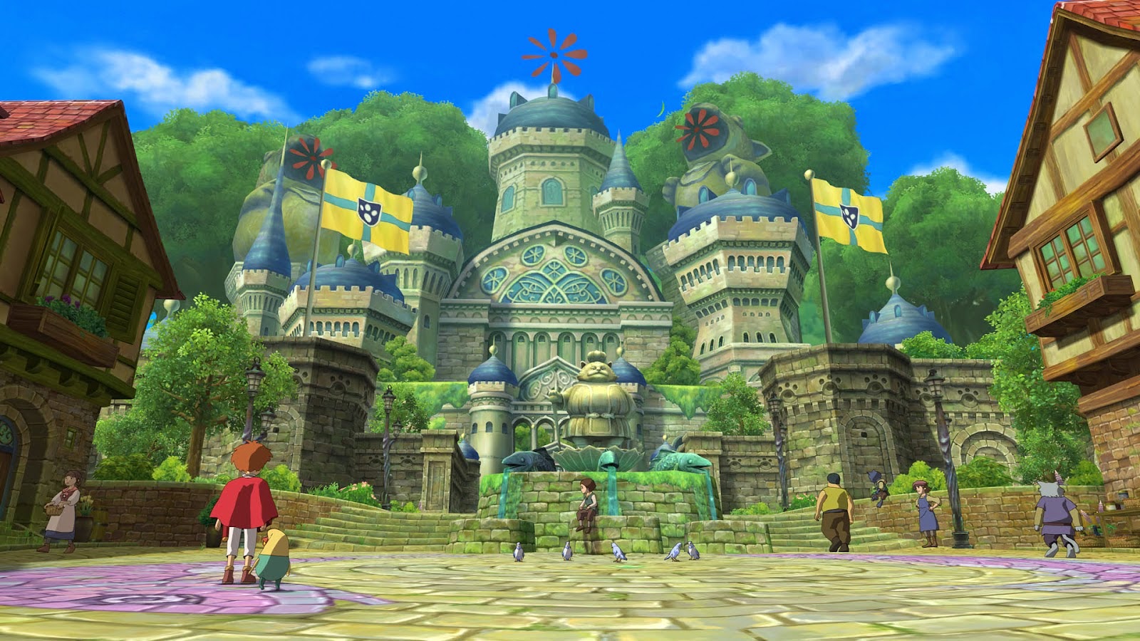
When I first played the game I was greeted with the gorgeous aesthetics of Studio Ghibli animation. The animation was crisp and clean with characteristics to the movements of the characters, each with there own twitch that made the movement more realistic. And when it entered the game visuals, the 3D characters absorbed the Ghibli aesthetic which worked so well, it felt as if I was playing within one of the films that the animation studio had made. Being able to explore both the fantasy and the reality worlds was amazing with little details of being able to walk into shops and explore different areas was amazing. The use of the camera angles in the game as you explored the cities and other areas helped to enhanced the visuals even more. You could tell that the game was aimed at an younger audience by not only the character designs but the use of the game play with leveling up little monsters that you have charmed. However I still felt that the game would be loved by most ages especially if you were a Studio Ghibli and Level 5 fan.
I wanted to try and find a few samples of the storyboards or at least some layout designs but I could only find a few images referring to the storyboards of the animated cut scene in the game. However from this storyboard I can see the light direction and the type of shot that the frame will have. I also noticed the guidelines of the characters drawn with blue pencil, which in relation to the features and body of the characters, it was interesting to see how it has progressed from that stage. The watercoloured images by Momose Yoshiyuki were gorgeous, it really depicted the fantasy and the character within the shots. I really want to try and use watercolour as a medium to depict visuals more often as they are quick and easy to use and help to enhance the atmosphere of the shot.
 |
| Momose Yoshiyuki Watercolour Storyboards |


No comments:
Post a Comment